



Ottilia Kelemen • Selected Work

Currently live • 2026

A case study • mobile • E-commerce

A Prepay Shop system to win the US market

00TL;DR

+26%

growth in US photographer base

Outcome highlights

US photographer base grew 26% the season after launch (multiple factors likely contributed, but the feature was a meaningful one)

Adopted by US photographers as a feature they didn't want to work without

Direct positive feedback including a thank-you video from an early adopter

What I owned

End-to-end design with my design partner. Usability testing, illustrations, dev workshops, and the front-end prototype approach we used to compress design-to-dev handoff.

01The Problem

GotPhoto's European product worked on pay-after-delivery: parents see the photos first, choose what they want, then buy.

That model couldn't move into the US because US school photography ran on prepay. Parents paid before the shoot, usually through paper order forms collected at school, and photographers used that early cash flow to estimate the size of the job and plan production.

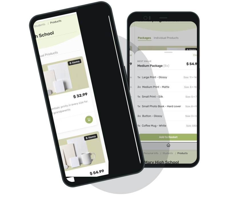
Two phones showing the prepay shop: a school photoshoot page listing package cards, and an opened package with its contents and prices

For US photographers, prepay wasn't a competitor feature to match. It was how the business worked. Many wouldn't take on a tool that didn't support it.

The brief was to build a prepay shop.

The design problem was harder: parents needed to buy specific products, not vouchers, before any photo existed to show. On their phone. In the few minutes between getting a school email and getting distracted by something else.

02Two Surfaces, One Product

The shop was mobile-first for parents. The configuration for photographers lived inside GotPhoto's existing admin tool, alongside the rest of their workflow.

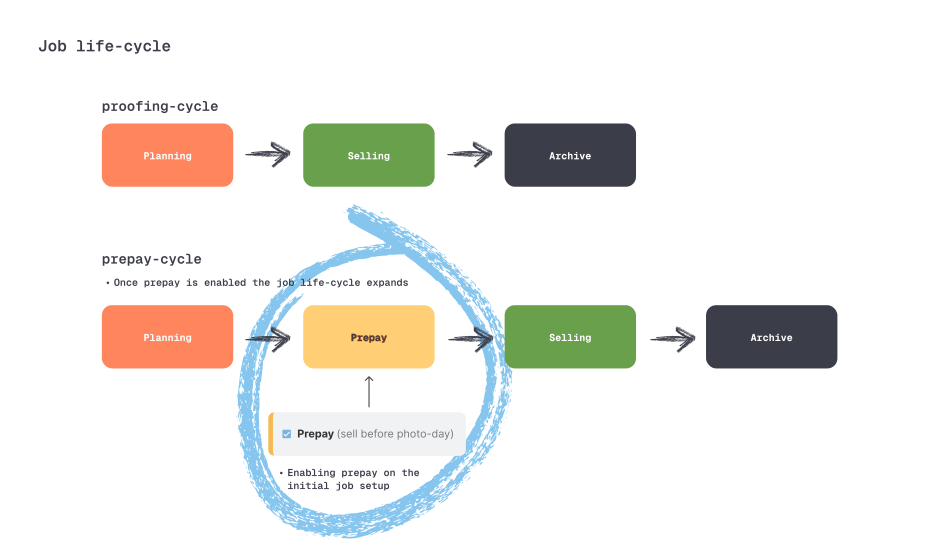
Job life-cycle diagram: the proofing cycle runs planning, selling, archive; the prepay cycle adds a prepay stage, circled in blue, between planning and selling

Photographer side, configuration inside the admin tool. This was the harder integration problem. Setting up a prepay shop meant configuring packages, prices, branding, and payout details inside a legacy admin product that wasn't built for any of it. The design constraint was strict: the new flow had to feel like a seamless part of the tool photographers were already using, not a bolted-on second system.

Parent side, the shop itself. Mobile-first, designed from scratch. Parents would open this on their phone after a school email, often one-handed, often with interruptions. The flow had to work fast, build enough trust to take payment with no product to show yet, and let parents pick the right package for their kid without comparison-shopping fatigue.

Holding both at once was the job. The parent side got the headline craft attention. The photographer-side integration got the harder system-thinking work.

03How We Worked

Seasonal urgency shaped the timeline. School photography runs on hard calendar deadlines, and the team needed the shop live for a mini-season pilot to test adoption at small scale before the main season ramp. Miss that window and the project loses a year.

Scenario mapping with customer-facing

Before any sketching, we worked with the US customer-facing team to map sales scenarios and customer types. The personas that came out of this named the segments the sales team was talking to, and shaped real product decisions: how package bundles were structured, and which additional features the core customer types needed to actually succeed with prepay.

User flow workshop with dev

Co-ran a session with the dev team to map flows before wireframes. This caught state-management questions early, like package vs individual product handling, cart state, and what happens when a parent abandons checkout. It let the dev team own the architecture instead of inheriting it.

Front-end prototype instead of InVision

This is the most interesting methodological move of the project. After evaluating UI frameworks and landing on AntDesign, we built the click-dummy directly in the dev environment using default AntD components. Not in Sketch, not in InVision.

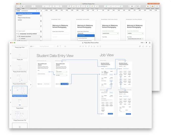
User flow board from the dev workshop: prepay login variants, student data entry, and job views mapped screen by screen

2020

Why it mattered

Design-tool prototypes were the standard, and they always lied a little. Transitions felt fake, gestures didn't quite work, and you couldn't test on a real device the way users would actually use it.

CODE

Building the front-end prototype

It meant we got honest usability signal weeks earlier, and the dev team started on logic while visual direction was still moving. The thinking is closer to how designers work now in the post-AI-prototyping era. At the time it was unusual.

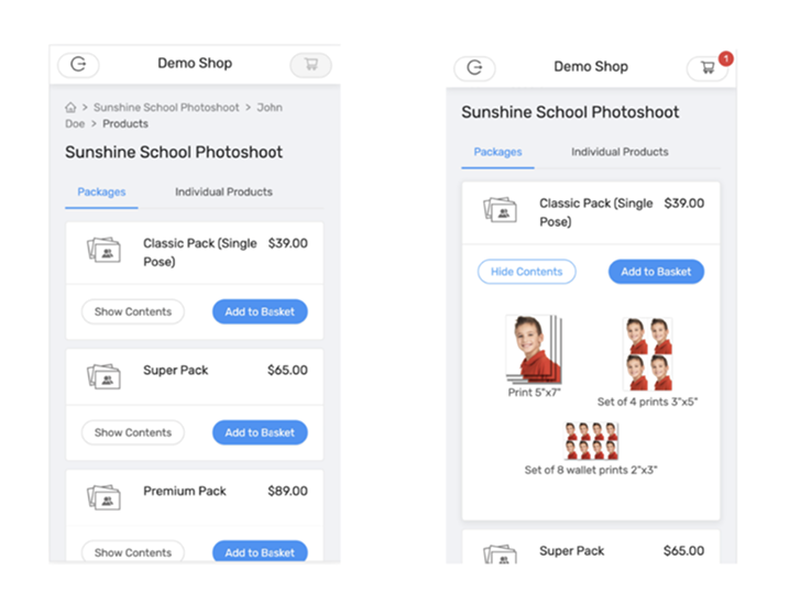
Two screens of the AntDesign click-dummy: the package list and an expanded package showing its print contents, built from default components
04Testing on Real Phones with Real Parents

The mobile-first checkout flow itself held up in testing. The lesson was that the harder design problem was understanding the full prepay mental model, not only online-shop mechanics.

The headline finding wasn't a usability problem with what we'd built. It was a scope problem with what we hadn't. Parents kept asking about features the shop didn't have, like choosing a background or adding retouching to photos that didn't exist yet.

These weren't edge cases. Enough parents brought them up that we committed to adding them before launch, which complicated the rollout but meant we shipped with the feature set the market actually expected.

Recruited through a research panel company, US-based, screened for “is a parent.” Remote sessions through Lookback, watched on phones the way real parents would use the shop.

05Outcome & Looking Back
US conversion + early adoption

Outcome

The shop shipped on time for the mini-season pilot. The following main season, the US photographer base grew 26%.

Plenty of factors likely fed that number, but prepay was a meaningful one: it closed the gap that had been blocking US conversion. Adoption backed that up. US photographers used it, the customer-facing team finally had a feature to win deals with, and one early adopter went as far as recording a thank-you video for the team.

Looking back

Mobile checkout got our best craft attention and the photographer-side integration into the legacy admin tool didn't get enough.

We shipped the configuration flow knowing it wasn't where we wanted it, and it took follow-up work across several seasons to bring the admin-side experience up to a level the team was happy with. Integrating a new workflow into a complex legacy product needed more research and testing than we'd planned for. We'd budgeted the project as “design a mobile shop” and underweighted the rework on the admin side.

The lesson I took away: when a product has two surfaces with different design problems, treat them as two projects with separate research plans, not one project with the budget split between them.

*Thank you for reading*