01_ Stats Cards
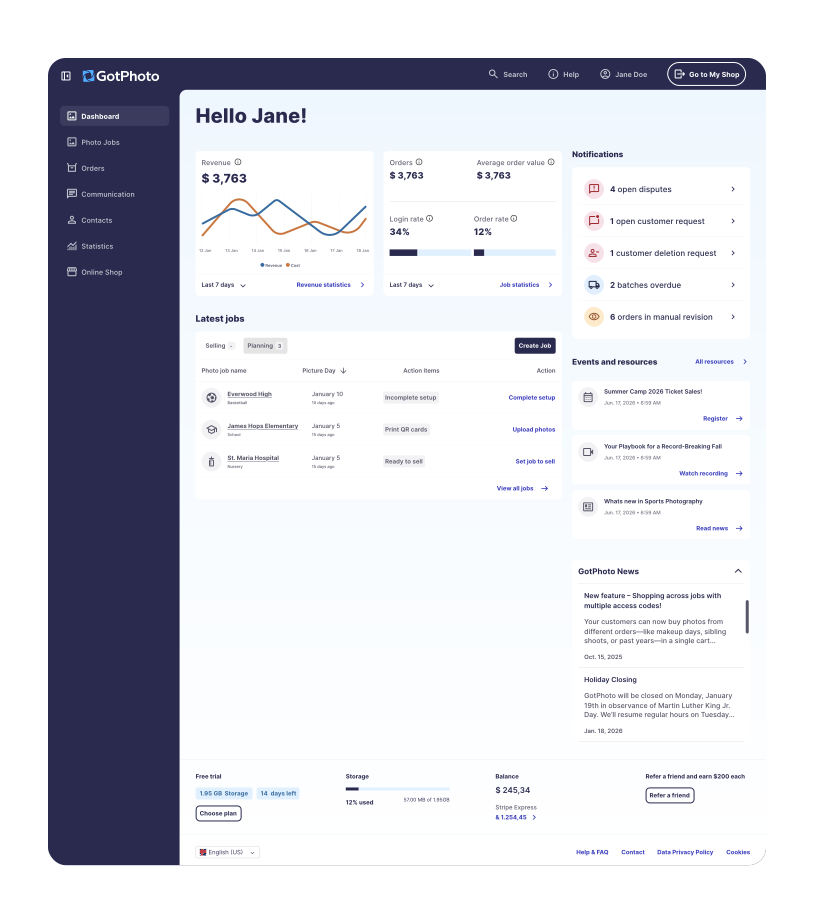
Revenue and order stats moved alongside login rate and order rate, so the financial numbers had context.

A case study • B2B SaaS dashboard


55 → 70
SUS from below average to good
The growth team owned a dashboard nobody had touched in years. The brief was cosmetic.
Research said the dashboard was actively blocking activation by prioritizing company metrics over user goals.
Inside the original timeline and using existing design system components, the scope expanded from UI refresh to structural rework: notifications, prioritization, onboarding checklist, the whole hierarchy.

About the company
GotPhoto is a B2B SaaS platform for professional photographers. It helps them run shoots, sell photos online, and fulfil orders. Users range from beginners taking their first paid job to studios processing thousands of orders a week.

About the team
The growth team owns the AARRR funnel. Product-led growth, focused on removing friction between signup and first sale.

About my role
Senior Product Designer in an autonomous trio with one engineer and one PM. We owned acquisition end-to-end and prioritized based on what would actually move the funnel.
The UX Overhaul In 2024 the design team launched a company-wide initiative to modernize the product, organized around a “hero journey”: how a beginner photographer reaches their first sale.
Why this dashboard, why now
The dashboard sat under growth team ownership but had been off-limits for years, too much technical complexity, too much risk. The UX Overhaul finally provided the organizational cover to address it.
Initial scope
Match the dashboard to the new design system. Add a clear entry point to job creation.
Yes, the dashboard is outdated but also actively blocking users from onboarding and revenue-critical actions.
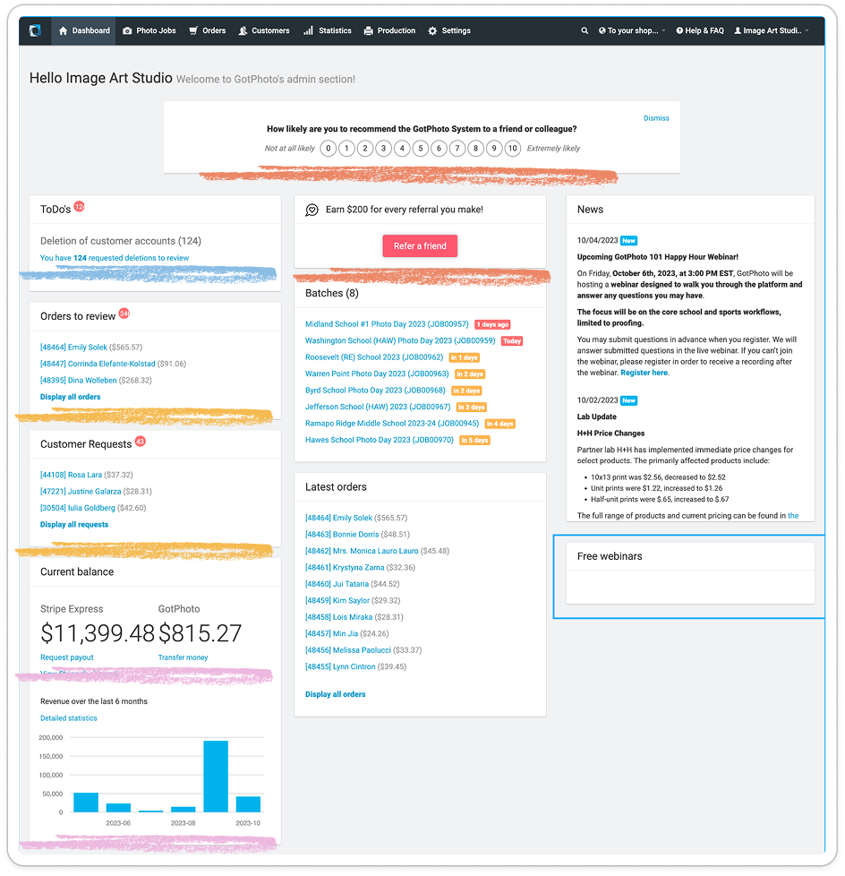

Company priorities were featured before users had engaged with the product.

Revenue-critical alerts were not clearly communicated.

The onboarding checklist had no progress visualization.

Financial data was displayed without context.
The interface was telling the company's story instead of helping the photographer do their job.
We had approval for a limited UI refresh. Research surfaced fundamental activation problems.
The question became whether the scope could expand strategically without breaking the timeline or the technical constraints we'd inherited.
The answer was yes, but only by holding the line on three things:
Original timeline. No extensions for expanded scope. Existing components only. Anything custom would slow the broader UX Overhaul. No new engineering load. The dashboard's legacy code couldn't absorb complex features.

Inside those limits, the effort-impact map shows what made the cut. Everything in the top-left quadrant, high impact, achievable with existing components, went in. The bottom-right got documented and handed forward.
Time and budget were limited, so we pulled on internal expertise.
Our sales team, brand ambassadors, and customer success agents talk to photographers every day across the full lifecycle. They see patterns across hundreds of users that individual interviews miss.
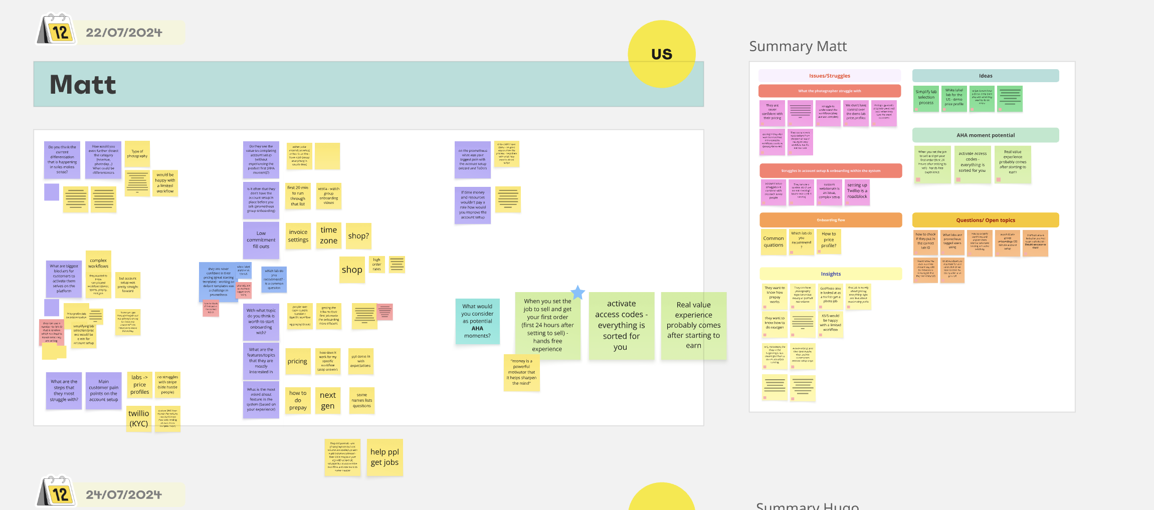
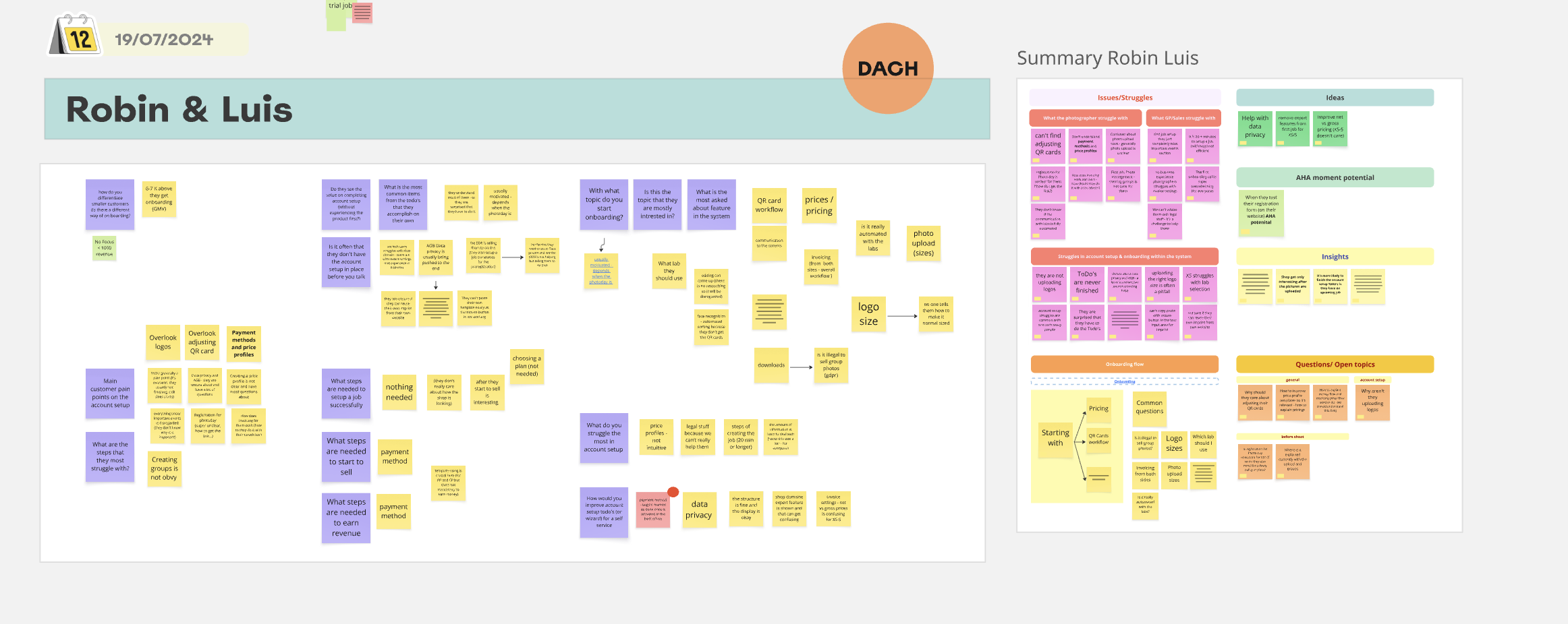
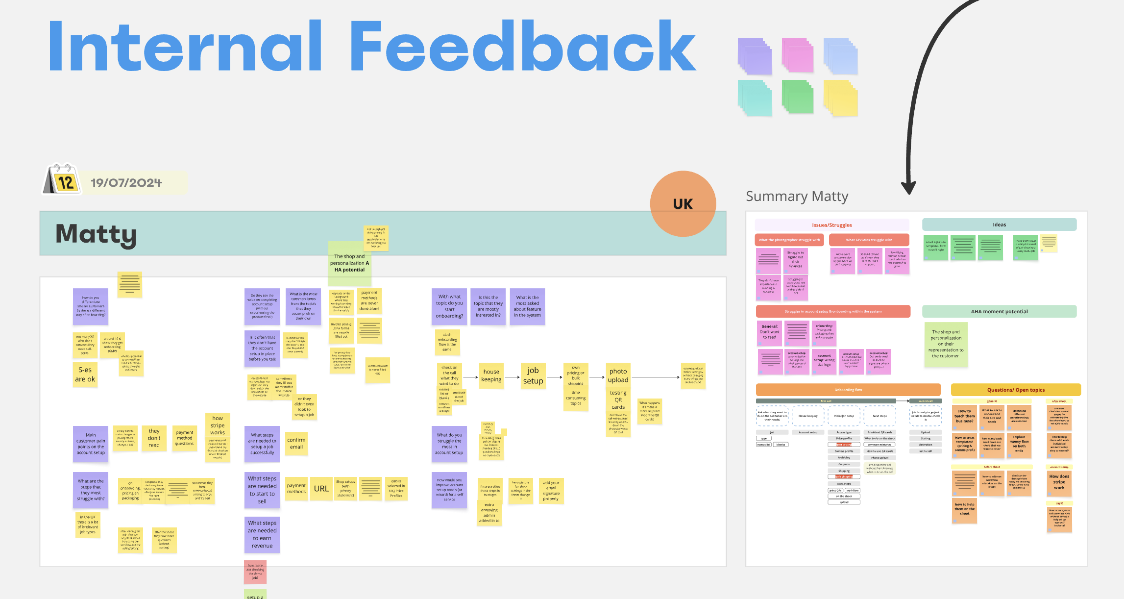
_What surfaced_

1_
Missing functionality
No notification system for urgent tasks like order complaints, missing payment details, or stuck orders. Users were missing revenue-critical information because the interface didn't surface it.

2_
Unusable information architecture
Financial stats had no context or filtering. The jobs section was missing essential filters and status visibility. Users couldn't act on the data we were showing them.

3_
Interface clutter
NPS surveys and referral prompts featured prominently before users had completed onboarding. The news feed was creating banner blindness. Promotional cards were obscuring primary tasks.

4_
Buried activation tools
The onboarding checklist had no progress visualization and no motivating design. Random ordering and unhelpful copy obscured the value of completing the harder setup tasks.



Four areas changed how the dashboard worked, not just how it looked. Each one came out of a specific research finding. Each one shipped with existing components.

 010203
01_ Stats Cards
Revenue and order stats moved alongside login rate and order rate, so the financial numbers had context.
02_ Notifications panel
The old dashboard had no system for alerting users to revenue-blocking tasks. Disputes, customer requests, deletion requests, batch failures, manual review queues, all of it was either buried or invisible. Photographers were losing money to things they didn't know were happening.
03_ Job Operations card
The latest jobs section gained essential filters (selling vs planning), action items, and a status column users had been working around.
_Populated_
 040505
04_ Onboarding checklist
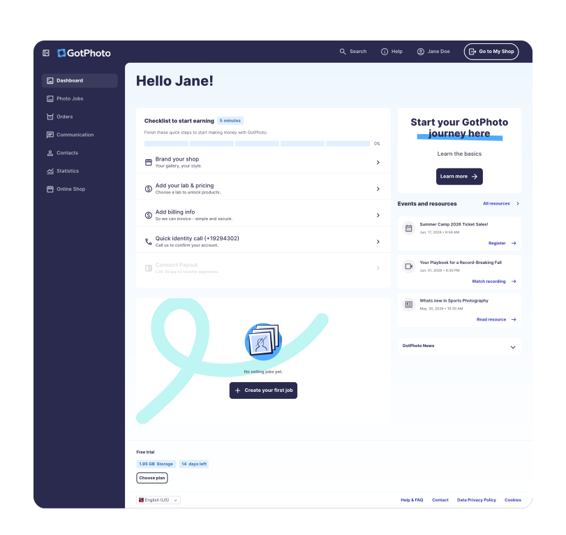
The old checklist showed items in random order with no progress indicator. Users had no sense of how close they were to selling, which meant the harder setup tasks like lab and pricing or payout connection were the first ones abandoned.
05_ Hero journey starting points
A clear "Create job" button moved into the operations card, where users actually looked for it.
_Onboarding_

01
Notifications
The new notification component sits in the top-right of the dashboard and prioritizes by impact: open disputes first, then revenue-affecting blockers, then operational items. Built entirely from existing card and icon components from the design system.
02
Onboarding Checklist
The new version shows a progress bar, sequences tasks by dependency, and uses copy that names the payoff of each step instead of describing the action. Small change, meaningful shift in completion data downstream.
03
Operations & Stats
None of these are new components. They're the existing system, arranged to match how users actually scan the dashboard.
55 → 70
SUS
One round of internal usability testing with 8 participants. Small sample, single round, but the score crossed the 68 threshold from below-average to above-average usability. The shift matched what we were seeing in heatmap data and team feedback, which gave me enough confidence to ship rather than wait for a larger second round.
+7%
YoY US XS-S cohort, pre-high-season
Signup → first task
Year-over-year comparison in the cohort that received the redesign first, measured at the same point in the seasonal cycle both years. The redesign was the most significant change to the activation surface in that window, but other variables moved too: marketing, onboarding emails, adjacent feature releases. Suggestive rather than conclusive. I can't claim attribution cleanly, and saying "the dashboard caused 7% growth" would be overstating it. What I can say: the metric moved in the right direction, in the right cohort, in the right window. That's the honest read.
3x
Checklist progress
XS customers without sales onboarding completed roughly one task before the redesign, usually shop setup. After rollout, the same cohort more often reached task three before dropping off. The redesign got people deeper into the checklist, but the steepest drop-off remained at the phone-call ID verification step, a structural blocker the dashboard couldn't solve. The shift confirmed the redesign was working on the part of the funnel design owns.

+3%
points Hotjar, one-week off-season window
Create-job button CTR
A small, directional bump rather than a headline number. Off-season measurement window and short timeframe mean I can't claim it as conclusive. Worth naming anyway: the direction matched expectations and the qualitative feedback, and the redesign's job was to make the action discoverable, not to engineer click pressure.
Finance widget
“Finally a chart that makes sense”
The redesigned widget got direct positive feedback from brand ambassadors, who use the dashboard daily with photographers. Beyond reception, the widget surfaced something we hadn't been looking for: its numbers didn't match the legacy statistics page, and the discrepancy turned out to be a data inconsistency in the old surface that nobody had caught. A design intended to make existing data more legible ended up improving the data itself. Not a metric I'd planned to measure, but a useful proof that clarity in the interface can pressure-test the system behind it.
*Thank you for reading*